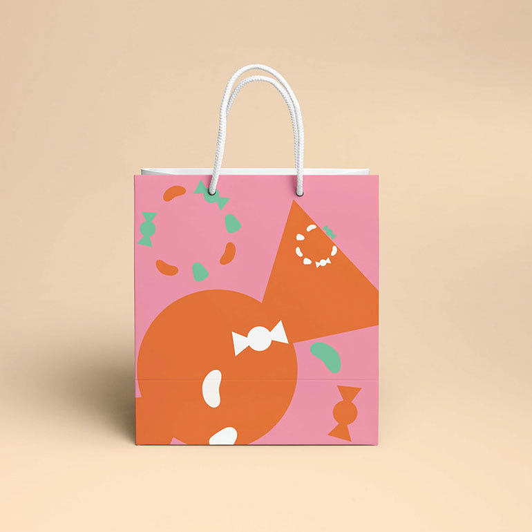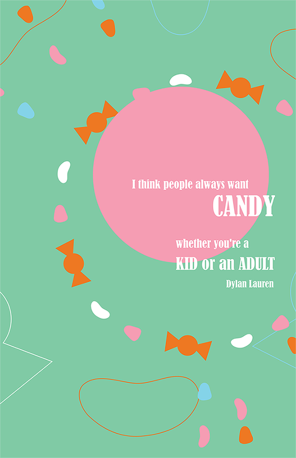
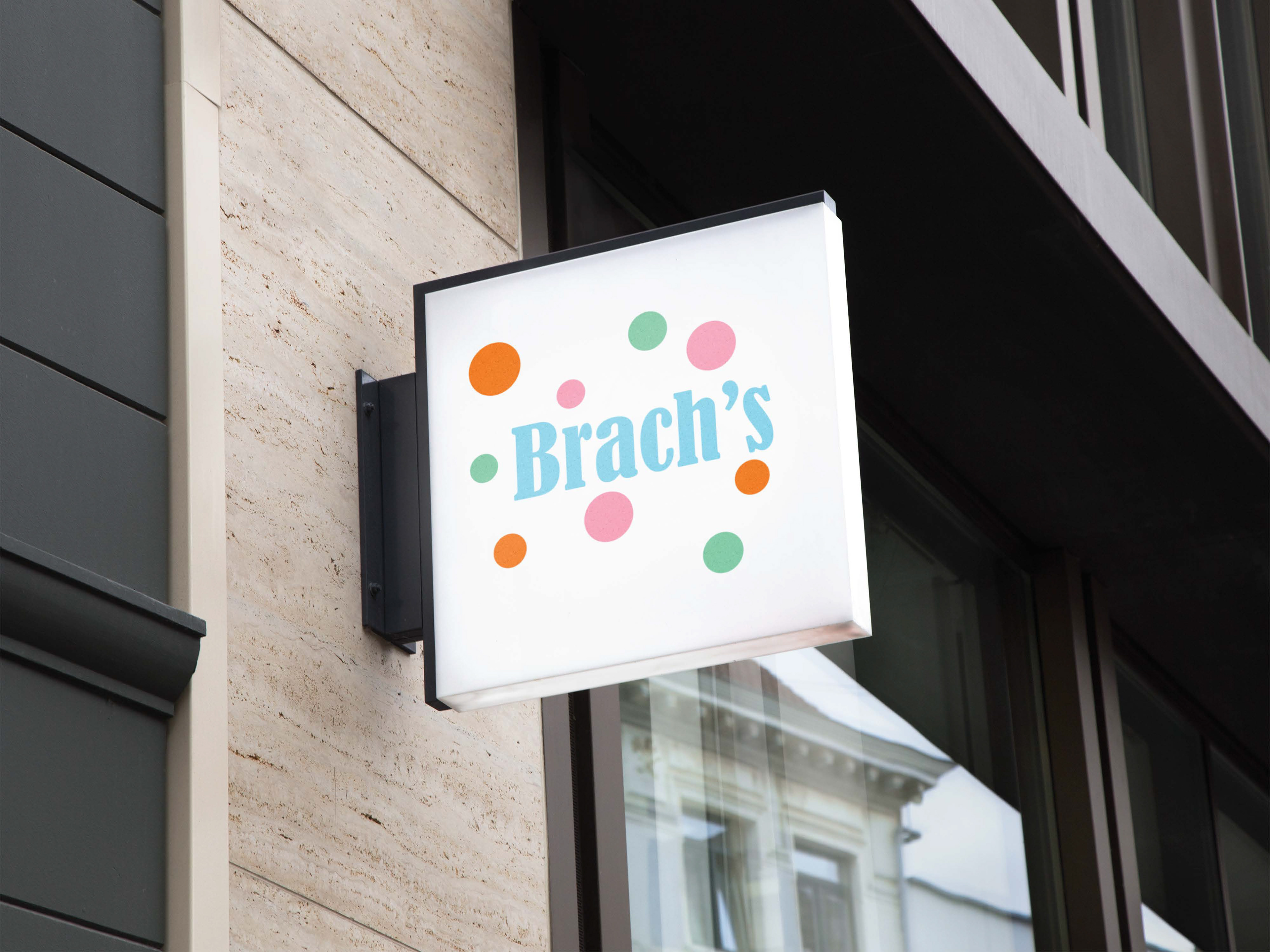
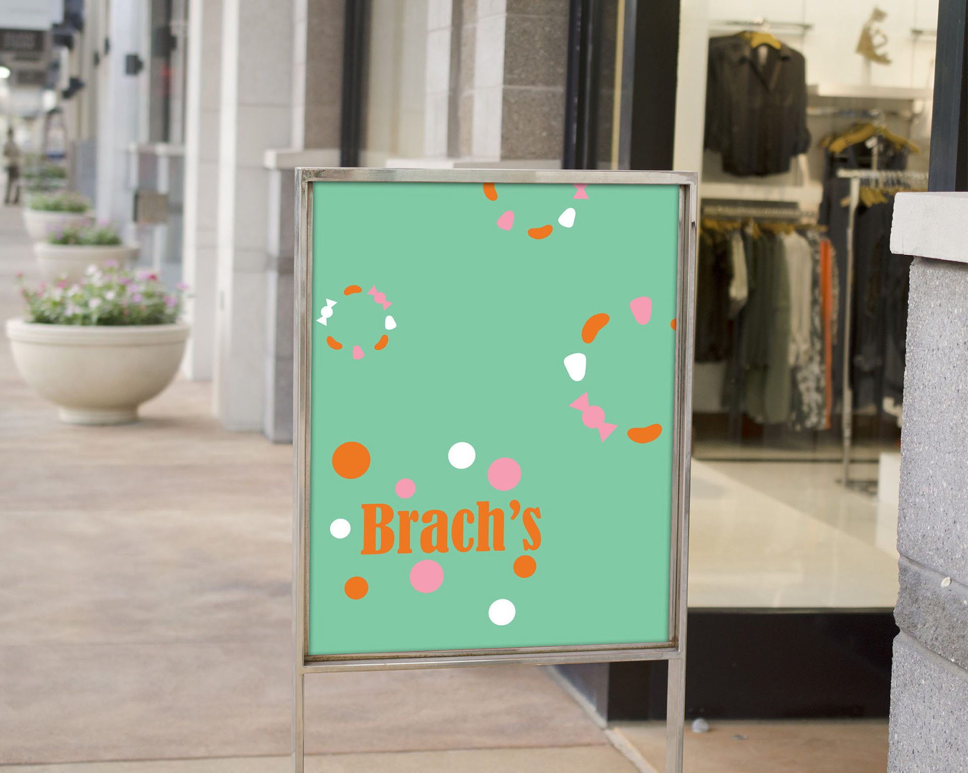
Brach’s is a brand redesign made for a pop-up shop. I designed packaging that would be used for a pop-up shop. The objective was to create the products with a fun playful and modern aesthetic I loved the idea of candy and making designs that were based on that. I wanted to see the way I could interpret the use of candy shapes. I chose to have circles as a design element because they express movement and energy, I also feel they are a shape that can be found in various candies
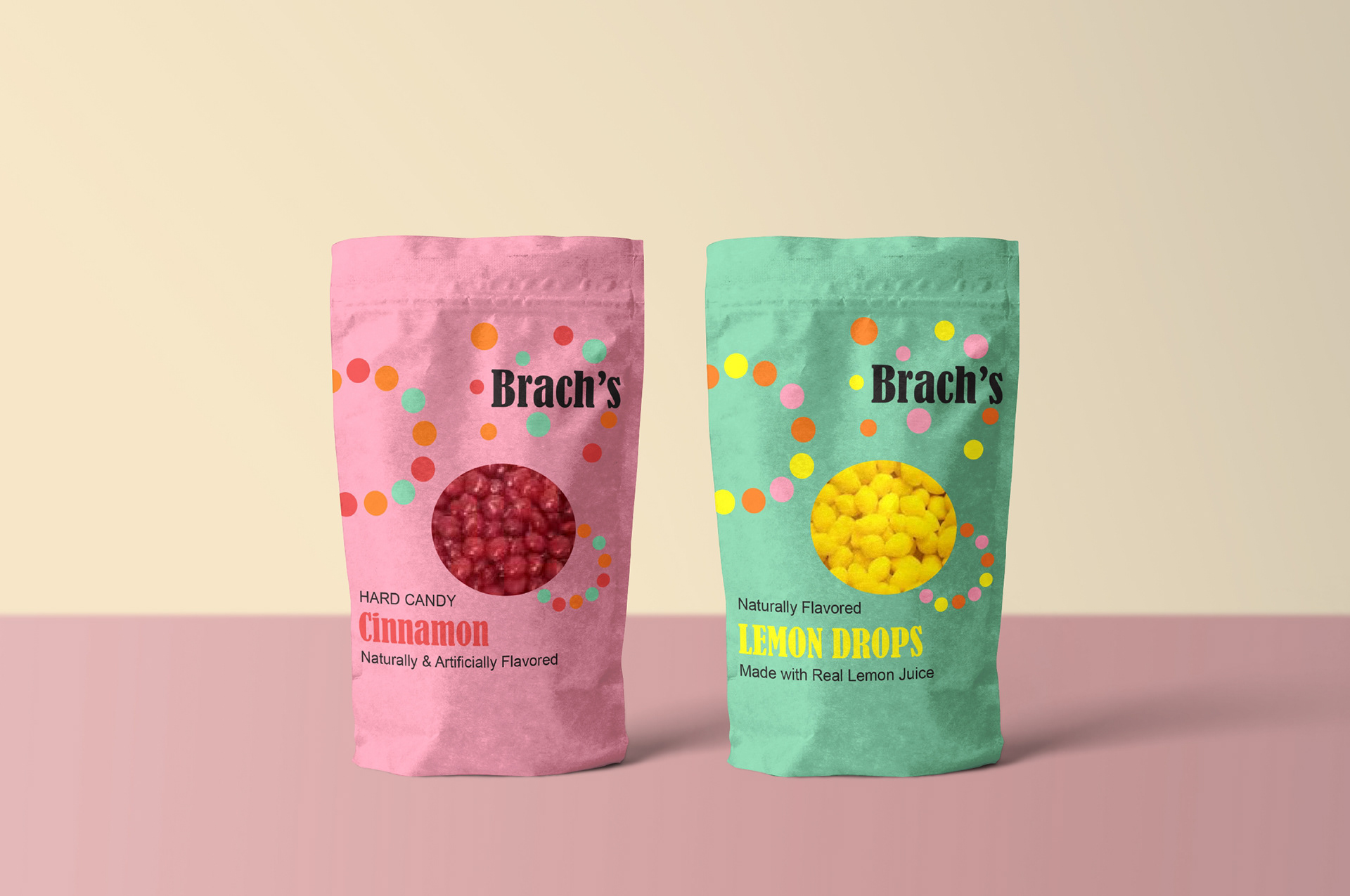
Hard Candy bag design

Chocolate bag design

Packaging for purchased items